Friday 25 November 2011

Why i chose certain

·          Settings

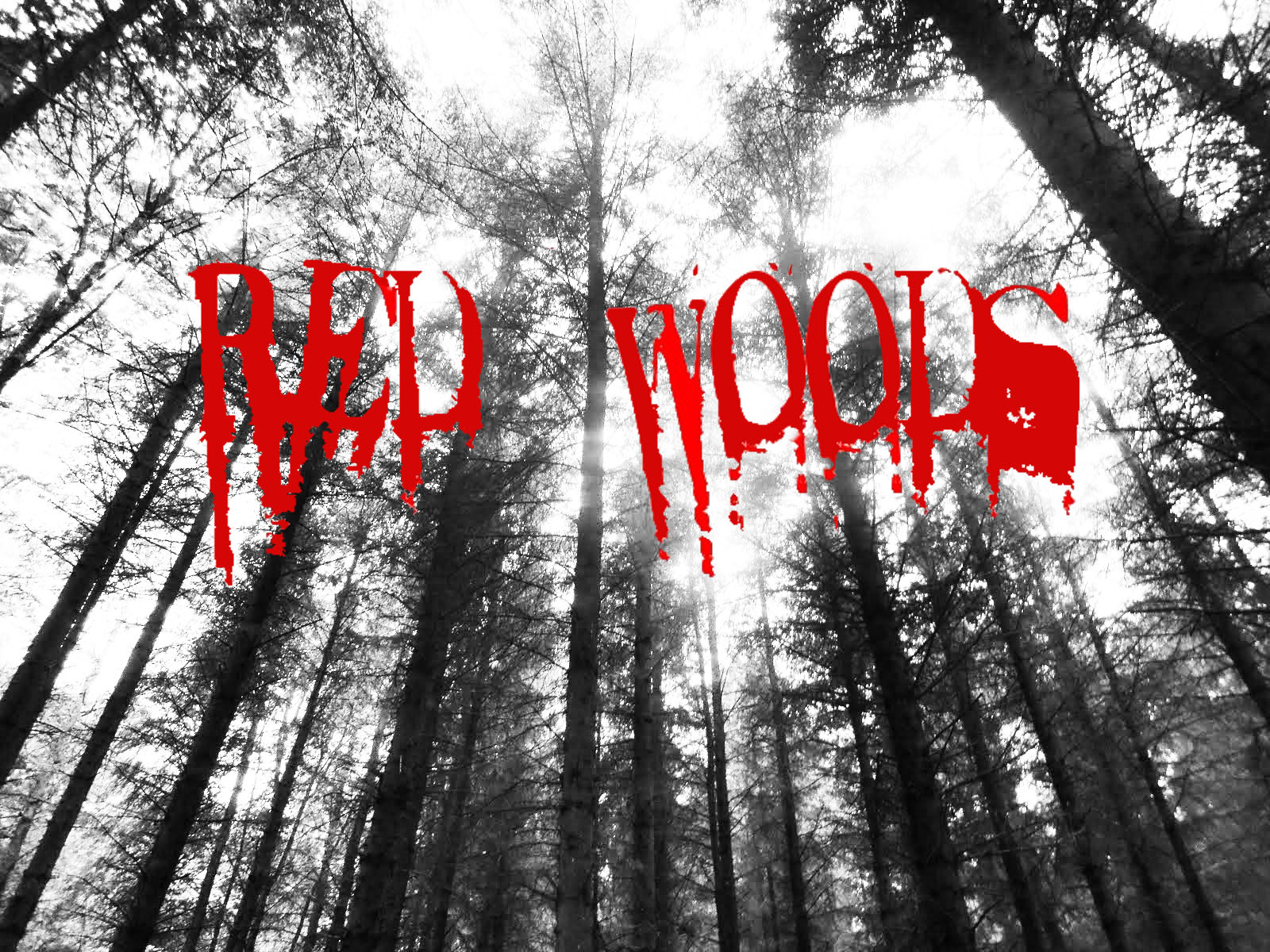
As I live in the area, I often walk through the woods and thought it would be the perfect setting for I movie. Before we choose our setting, I took Immy to the setting and that is where we got some preview shots and setting ideas. After visiting it, we knew it would be perfect for our film, which we would shoot there in the following weeks. The only problem with this location is that it is quite hard to transport all of the casts, crew and our equipment considering most of them live at fram. Our biggest concern with filming was the lighting, but now that we have completed our trailer, it didn’t turn out to be problem at all. It wasn’t that dark when we were filming, but it was aery suitable as it was very dull and murky. Another problem we had when we were planning as that we were worried about being down the location as it got very dark very quickly and the woods were in the middle of nowhere with no man made lighting or local houses. To balance this out, we took some torches down and all of our actors had mobile phones (will coverage). Another advantage is that with our setting being so remote it meant that it was very unlikely that we would have anyone walking through are camera shot. This gives us a little more freedom on shooting as we were not limited to shooting any parts for the woods.

·          Characters and clothing

Emma Dixon (our female actor), doesn’t wear a lot of make up in our trailer. This came as an advantage as it made her look less artificial and more believable as an actor the audience. When we planned her outfit, we wanted basic clothes with not a lot of accessories or excess clothing items.  The point of this was to draw the audience attention to Emma’s emotions rather than what she was wearing. Giving the actor a more innocent, natural feel would make the audience feel more in common with her as she isn’t an “artificial actor”. Liam (our male actor) was meant to be the more dominant character who was there to scare Emma. An advantage is that he is very tall making him look very powerful and he also had a more dark range of clothing on, making Emma stand out for being even more innocent. Both of our actors costumes were “block colours” which means they very most visible, considering the woods is a very busy and overcrowded area. The audience will judge you by the clothes our actors wear and associate them clothes with their identity.

·          Our story and our myth

From the beginning, me and Imogen knew that we wanted to do a horror film. However, we knew we didn’t want to create a so called “part 2” to our AS project. From the experience we gained from that project, we wanted to show it in a more challenge way. When we visited the woods, we also went down there to look for ideas for our plot ( this was very early on in planning ). It was shortly after that we saw some mines and thought they would be a good basis for our myth. When we were finally established on a myth, we were stuck between 2 different scripts. We then asked all of our media class and outside members (aged between 15-22) on which they would where the best. This helped us to choose the script which was more suitable. After asking people why they choose that perfect script, we asked why and the main improvement they said would benefit us was that we should take out one line which was, “once upon a time”. The myth relates to both the setting ( the woods ) and what will happen if someone enters the forest.

Some Furthur research added


While doing so extra research on film trailers, I came across the film “CABIN FEVER” with the tag line “CATCH IT”. It stood out very well as it is a very similar design as our movie poster. Both in similar ways such as


  • Colour scheme – Black and Red. The black representing the darkness and evil with in the forest and blood having the common representation of blood or gore. Red and black scheme to be the most commonly recognisable colours when it comes to the horror generation. and as our film is breaking into the film market, we want the audience to straight away recognise our film with horror.
    We plan to use darkness giving the impression that everything is swallowed by the darkness and it  gives off a feeling of being trapped, away from anyone who can keep you safe.
  • High angle shot - looking up at the trees – giving the impression they are more powerful than the house or the people within it. Furthermore, the fact that the camera is looking “up” at the woods, it makes them look also inescapable.
  • And also where the cabin is placed in the poster is very similar as out tent is placed exactly in the middle to show to the audience that all attention and the following events are based within or around it. In both ours and CABIN FEVER’s poster, the cottage or tent looks remarkably small compared to its surroundings. The location ( in both movies)  takes centre stage. It is depicted almost like the cabin is fearful of the forest, giving the impression that anyone who stays there is doomed also. We really our audience to feel fear and anxiety when they see our poster.

Thursday 24 November 2011

Finished shooting and our Rought Edit

 We have finally completed all of our footage for our trailer. We also had a lot of outtakes that may come in useful if we decide to create a blooper reel. When we finally got the actors to agree on a time and date, they both acted and cooperated very well with the script that we both designed. After some unfortunate events from our AS project, we decided to shoot more footage than we actually needed, because if we went back to re-film a short section, we would have to make sure the
• Weather
• Appearance of the actors
• Lighting
Was exactly the same as when we first filmed. Before filming we had already filmed some extra clips from the woods when only one of our actors were available. These ranged from someone screaming, running in the woods and being chased and falling down. Doing this proved to be a good success, as one of the photos we took is now going to be our main picture on our poster design. However, constantly having to rearrange our production schedule has set us back around a week and a half compared to other members of our media class. To counterbalance this problem, me and Imogen have both being working in our free time to make sure we stay up to date and do not fall behind as this can cause a lot of problems further down the line. Last year, our project contained a lot of sound effects that we needed to add in. this means we had to spend around 3 hours just making sure the footage was in sync with the audio. This project is likely to be very similar as we are planning to add sound effects after our rough cut is completely this Friday, we plan to spend just as much time carefully cutting our audio to match our footage. If it is done incorrectly it can look very messy and unprofessional and that is not what we are aiming for as we have learnt a lot of skills from our first project, so we should have produced a better quality project that shows our experience.
A very strong advantage of our setting is that the woods make our environment very shaded and dark which gives the feeling for movie being in the horror genre. I was quite worried when we were shooting that the cameras would not be able to pick up a clearly enough image, but when our footage was uploaded, it turned out very well and useable.

Thursday 10 November 2011

Creating our posters

For all 3 of our designs, Me and Imogen used Adobe Photoshop C3S. We copied and pasted both our title and our blood splattered background on. The picture of the blood spatter was fine as it was; however, the text needed a lot of editing. We used the “Magic Wand” to select our text from the background; this took some time as our text is quite grainy and rough. Unlike our AS project, we have spent a lot more time researching into font type and colour schemes. We have decided on black and white with red. For example, our background pictures with the fonts over the top would be to light if the pictures were in colour. Black and white takes away the 'distraction' of colour. The viewer’s eye concentrates on the subject itself. Tones, shapes, textures, light play, shadows, and depth of field all become more apparent when the element of colour is removed.

The text was previously black and we tinted it up to a dark red – darker than the blood splatter on the page, to make sure it was too dull, as we didn’t want it to blend in and be unnoticeable. We then copied and pasted the finished text on top of our picture. We have to alter the size and we wanted it positioned at the top of page, were the page was lighter. We also, did exactly the same with the woodland pictures.


Title's for our trailer and Poster Design


These 3 photos we have made in this lesson. We have not yet committed to one photo as we plan to spend a lot of time and effort to make them perfect for representing our A2 project. Personally, I like the Red Woods design with the blood splatter on it as from the beginning it tells the audience that it is a horror film and is likely to shock. However, the other two, they both contain photo’s we took at the set, showing it is more connected with the film. Also the picture in the background is looking up at the trees and giving the audience the impression that the forest is more powerful than the characters that are about to camp there. It creates the illusion that the forest is never-ending as it looks like it is on such a large scale making it seem even more intimidating. So to resolve this problem, i have printed of 10 copies and getting different audience memebers to choose their favourite and i will be updating my findings soon.
“We are currently shooting a horror trailer for our media A2 project and we would need some audience feedback to choose the appropriate material. We also have to create a magazine article and we are choosing between a range of different fonts that will suit our movie of the horror genre and even for the title in our trailer. Please select which font you like the best …"
We gave our questionnaire to 10 people and all of them preferred the same font which is featured below. We also worked on photo and added a blood splatter background to make it look more bloody and frightening. The design below is something we tried out today, however, we are also currently working on another title background but we are inserting a picture of trees from our setting which relates it back to our movie. From our research we have gathered that the font the audience preferred was the font that represented the slasher/jumpy genre in horror films.


Tuesday 8 November 2011

We are currently shooting a horror trailer for our Media A2 project and we would need some audience feedback to choose the appropriate material. We also have to create a magazine article and we are choosing between a range of different fonts that will suit of movie of the horror genre and even for the title in our trailer. Please select which font you like the best ....( i have cunrrently handed out 8 of these to teenagers aged 15-18 (our target audience))

Wednesday 2 November 2011

Research and planning

As you can see, I have recently just uploaded our script for our A2 project. Me and Immy have also lately conducted some class research as they are our target audience (15-19 years old) and we asked them to choose between two different voiceovers we plan to use in our trailer. We are still carrying out some research into our voiceover, however, if the results show that both versions are good, it would be very easy for me and Imogen to recorded both as it is only an audio track not actually footage and could easily been completed at home. The class majority preferred the second script which is more lengthy and we also found that 3 students disliked one line in the script. So we asked them what they would prefer and what would fit better with our script and we are finally making small alterations to our cast’s script and the voiceover script. As our trailer involves a lot of “cuts to black”, we still plan to use audio when it has cut to black. We already have some pre-recorded audio such as Emma D (Female Actor 1) screaming. From research we gathered from other horror films, we found that the fades to black are very effective as when it fades, the audience expect someone very frightening to happen or jump up.

we have recentlty been looking at this trailer and it is very similar to the voiceover we want in our trailer both in length and tone. it helps set the storyline straight away to the audience. http://www.rottentomatoes.com/m/hatchet/trailers/10889295/

Our Script

Script

- A shot of the characters feet walking through the forest, e.g. river, mud -this will be for around 10-15 seconds. In that time they will be talking about the myth of the woods (of the last girl who died there). It will only be the male characters talking as in the story, they are continently trying to scare the girl (Emma Dixon) and from past horror films we have learnt that the female is normally the most innocent.

Liam (Males actor 1) - ‘Have you heard about this place?
- Shot of Emma’s feet as she walked
Emma (Female actor 1) – ‘No……’
-Back to close up of Liam-
Liam (Male actor 1) – ‘There’s a story about a girl who died here… Apparently she died in the mines in these woods”
Emma (Female actor 1) – “As if.
Liam - Male actor 1 - Seriously
(Pause)
- shot of the back of the actors head as they go down a steep hill
CAMERA SHOT- HIGH ANGLE – looking down making them look vulnerable
Emma (Female actor1) - ‘I’m not too sure about this…’
(Long pause)
We get to see all 3 characters setting up the tent. However, the female characters see's someone running behind the trees (only she sees it, making her stand out to the audience). The girl doesn’t want to let the boys not that they have got to her, and she turns around, shakes the sleeping bag and it cuts to black. We plan to have a large bang or thug as it fades.
-Shot from inside the trees of the actors-
Emma (female actor) = turns around and looks into the forest – looks worried
-Fade to black.-

This is where the main storyline of the trailer is put into place. it is the 2 boys holding torches telling the myth. The girl will ask and the boy 1 will says
Emma Dixon - "what have you heard?"
At this point, we cut to a voiceover of a small female child explaining the myth. As she is talking, it will cuts to varies shots of
-The girl looking very frightened
- The mine itself
-black and white shots of the forest and of the tent
Towards the end of our trailer, we will show the fire getting blown out and fade to black with a scream and the sound of people running and quick cuts of the characters running to add to the atmosphere.
(One of the male actors) – “It’s not a myth, it’s true. Around thirteen years ago.
CAMERA SHOT - An extreme close up of the actor’s mouth as they talk

-THE VOICE OVER – (lasts around 30 seconds )

Very fast paced clips of all the characters running through the woods and cutting to black.
The sound of
• Breathing
• Footsteps on the forest floor
Emma scream’s – and the film cuts to black

Tuesday 1 November 2011

Storyboard

Planning

As our media trailer is a horror and is also in the "paranormal activity"/"Blair witch" genre, we plan to use some hand held shots while we use the voiceover. As we are filming in the woods, we will have to take certain precautions to ensure our actors or filming crew do not get injured. When the voiceover is in our trailer, we also plan to have the shots of the woods in black and white as it is representing the past ( and the myth). We plan to complete our shooting by this Friday 4th November. All of our actors are aware of this and Me and Imogen are already preparing our props that we will need to take down to our set.
This is the tent we will be using, the red will look very striking and bold whilst in a very dark woods, and also the colours red and black
correspond very well together. as the nights are getting darker, it is likely it will be very dark when we are packing up and leaving, so we are taking a large range of torches and we only have a short walking distance to our pick up point.
Research from our target audience
I have recently (in the last 2 weeks) conducted some research into the audience’s perception of horror films. We asked them what they found most frightening. The 3 main responses were
• Psychology – 8
• Gory/bloody – 2
• Jumpy – 5
I also, only asked our target audience from 15-19 and got 15 different responses. Our film is mainly psychology and jump which seem to be the highest rated of horror films from our audience. Also, on our budget, it would be difficult to create a realistic looking “gory” film with the effects needed.
Planning
Setting – we are only using one setting as that is where the whole movie would be filmed and it is in Sherburn Forest
• Safety procedures –
• Mobiles X5
• Water as we will be using fire
• Transport X1 Car
Equipment needed:
• Basic tent
• Sleeping bag X 3
• 1 large blanket, duvet
• BBQ equipment and some basic good and drink
• Our 3 actors
Technological equipment:
• 1 school digital camera
• 2 personal cameras ( as this became useful in our AS project)
• 1 school tripod
• Torches X 1 for extra light in a dark environment