
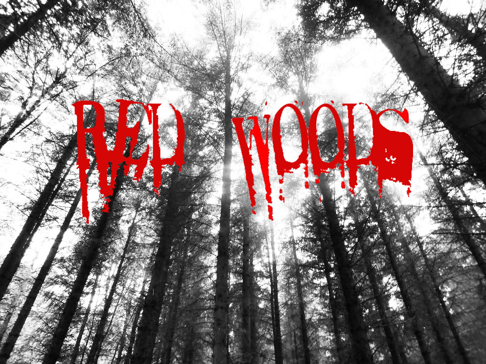

These 3 photos we have made in this lesson. We have not yet committed to one photo as we plan to spend a lot of time and effort to make them perfect for representing our A2 project. Personally, I like the Red Woods design with the blood splatter on it as from the beginning it tells the audience that it is a horror film and is likely to shock. However, the other two, they both contain photo’s we took at the set, showing it is more connected with the film. Also the picture in the background is looking up at the trees and giving the audience the impression that the forest is more powerful than the characters that are about to camp there. It creates the illusion that the forest is never-ending as it looks like it is on such a large scale making it seem even more intimidating. So to resolve this problem, i have printed of 10 copies and getting different audience memebers to choose their favourite and i will be updating my findings soon.
No comments:
Post a Comment