Thursday, 9 February 2012

"The making of" Imogen Moore and Stephanie M

The advantage of our film set is that right behind the tree, was a steep small hill.this gave us an advantage as it meant we could take our photo homever, we didnt capture the public places in the back such as the public footpath and local houses.Also,as Imogen ( or Ruby) is stood at the top of the hill which makes her looks more powerfuland dominering. Also, we were very forture as it was a very clear sky. This means that when we come round to editing, it will be more easy as there won't be any mixed colours in the sky and it would all turn out a very dark more scary colour.

This picture above was our orginal idea of that shot. We were planning for me to take the picture, Emma to be infront of the tree and Imogen behind her as Ruby ( the girl from the myth ). When we went to take the photo, it happened to be the day that our camera broke and the footage was lost. Since then, we have obtained our finally photo which only includes Emma - as we wanted all of the focus to be on Emma rather than Ruby - this is because in the trailer, Ruby is never shown however, we wanted to get Emma well established with our audience.


This picture above is the tree we used in our photo shoot, however, we decided to take the shot of the bottom of tree, As you can see the tree is quite haugthing, however, our actor could not reach that height and the roots of the tree looked a lot more scary and helps us to enclose our actor almost like she is sitting in the tree. When we first found the tree that we wanted in our shot, we had planned to have text on the bark however, when we finally got round to experimenting with font, it looks to crowded and unrealistic.
As you can see from the picture above, it clearly shows a public fence and a public path. As our trailer and magazine photo cover were taken in places, we had to make sure that both of the pictures resembled one another. To compensate this, we took an extreme close up of Emma ( our main actress) against a tree in the woods - this ensured us that we would not get any unwanted objects in our shot such as people passing through, roads or houses.

Friday, 3 February 2012

Starting our poster

We have recently started on our poster and we are trying to make it a bit scarier so it actually looks like it belongs in the “horror genre”. To do this, we have edited the photo on Photoshop by adding some a dull red layer over the top of the photo. Not only does this help to make it look scarier but it also blocks out a lot of sunlight as our photo was taken during the daytime. We have also edited some of the back ground of the picture as we wanted fore ground to attract more attention. The fore ground we have tried to draw the attention to the most is Emma ( our lead actress) and the main tree that she is hiding behind. The poster above this, is our image edited so far, considering our magazine cover is completed. In the next few lessons, we plan to edit the photo a bit more by editing the lightness of the photo and hopefully making it darker and therefore making it seem a bit more scary and after we have completed these stages we will then add the text. However, unlike the movie cover, we will include more information about the film's release - such as dates - unlike the movie cover which is mostly advertising, considering it has to advertise other stuff inside of the magazines. The poster will give us more of a chance to persuade the audience to go and see this film ( as it purely just to tempt the audience, into seeing just this one film). 

Wednesday, 1 February 2012


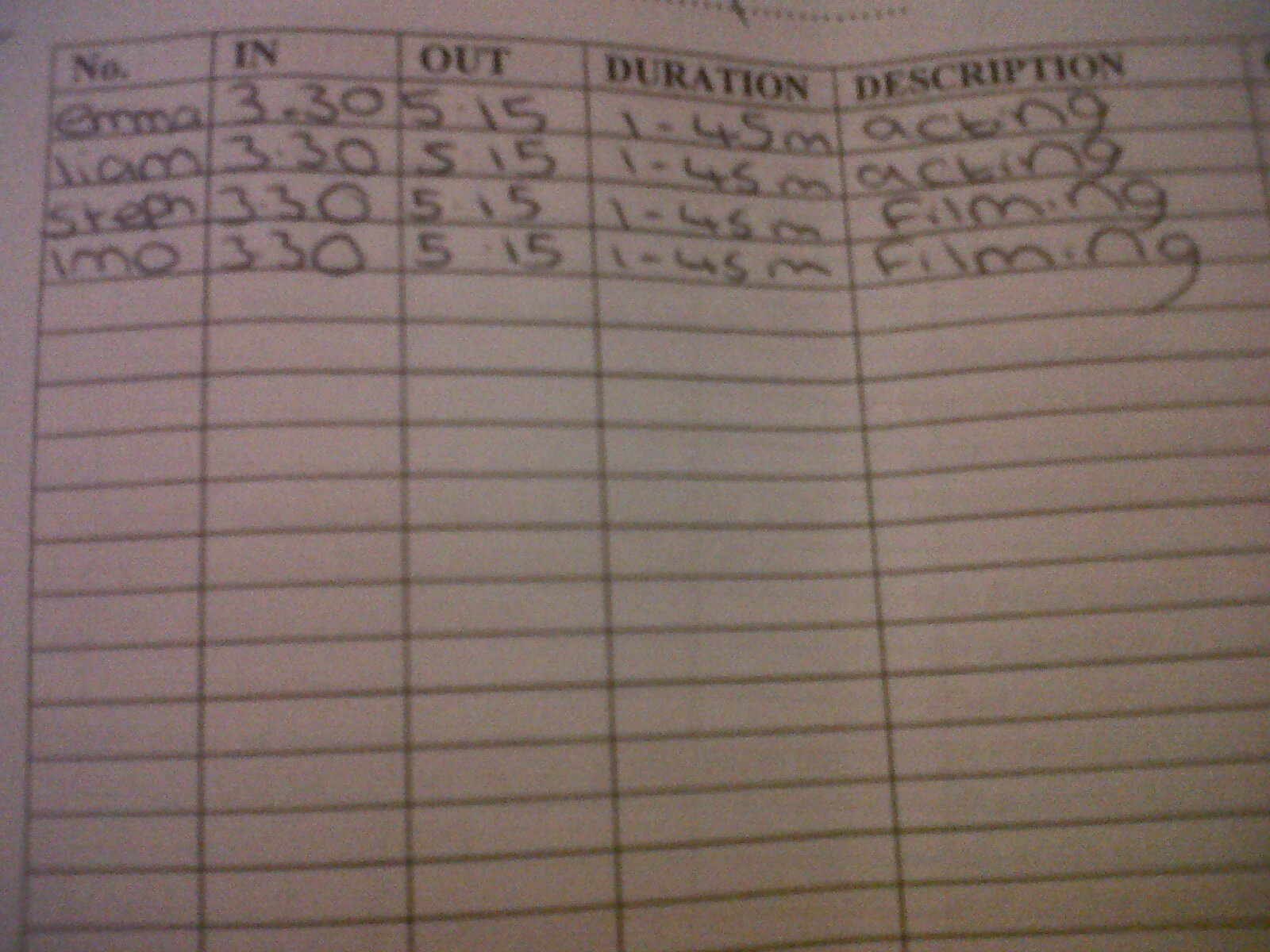
The two pictures above show our “Log Sheet” from media. However, it does not contain that much information considering we filming all of our footage on the same say with only two crew members and two actors. However, during filming, as me and Imogen were setting up our tripod, we let Liam and Emma have the camera's to film some of their own footage ( which we plan to include in the making of). Hopefully today ( or in at least the next two days ), we plan to filming our main actress Emma talking about her acting experience. I have recently contacted Emma and Imogen and we planning to shoot some more with Emma - mainly just in more detail about her experience and general questions such as
  • If she believed we did our job correctly?
  • Did she enjoy the experience?
  • Did Liam put in as much effort as her?
  • If she could do it again, what would she change?
  • Do you thinking the setting and storyline was appropriate?
  • Did the crew members give you an opportunity to include your own opinion?
We also plan to let Emma give me and Imogen some questions such as -
  • Did the whole experience go how you predicted it?
  • Did the actors do a respectable job?
  • Now you have started editing, is there any think you would do differently? - such as filming some more material, filming at a different time of day, filming an alternative ending, film at a different time of day?

As one of our print products is near completion and the 2nd one is currently been worked on, I though it would be a good idea to include some more-in-depth knowledge about our filming experience and how we have progressed from AS. Also, the answers we obtain from Emma will come in very useful in our evaluation ( which is not very far off), Me and Imogen have already come up with a basic outline of answers as we know we do not have that much time left - and we still need to complete our final print product) and we want them both to be to the highest standard  we can achieve. 

Tuesday, 31 January 2012

This weeks plan -Tuesday lesson

Imogen have brought in her laptop, so we can both have a final run threw of our trailer. We also plan to include a few more titles and credits, (as in my personal view), i think it looks a bit more like a film clip rather than an edgy, fast paced trailer. To counterbalance this on Tuesday, we are both going to observe our piece and choose points we both agree on, on where to add the appropriate credits.
The picture shown above is a "Typical" ending to a trailer,which often includes information for the audience such as
  • The name of the distributor
  • Production
  • Name of the director ( often if they are very well known) and who it was written by
  • Name of the movie
  • Logos
  • And most commonly - other forms of information such as movie websites that promote the films
We already have already planned our together what we are going to include in the final slide of our trailer. Most basically, we are going to include the name of our film. Uncommon to other trailers, we are going to include our title on a page of its own, considering this is our first production. This credit page above ( for Super 8), has clearly been designed to draw attention to the title instead of the artwork.
Imogen's laptop at the moment is broken, however, it will be back tomorrow. Meanwhile we are focusing on our poster ( as our poster product is near completion). For the time being, we already have our chosen image for our poster but we are not certain which texts look good together, considering we don't want our two prints products to look identical as they will be advertised in different places and for different reasons for example the Empire cover is aimed directly at film fans, whereas hopefully, our poster will be advertising to everyone as it could be advertised at a bus stop, billboards, radio and television stations.

Friday, 27 January 2012

My Audience Research-( To help with the evaluation )

The picture above is the questionnaire i have recently been handing out around Sixth Form to get some audience feedback on our print products. The graph below shows my results -

This pie chart shows the answers. the question was " What genre do you think the poster represents"

This pie chart represents "What do you think is the best part of the magazine cover?"
This bar chart shows the answer of the participants. it was "Do you think it represents the horror genre well?"
  • The majority of the feedback was positive. One question i included in the questionnaire was
  • "Please state on advantage and disadvantage of the poster?"
  • we received answers such as 
  • it advertises the film very well and looks very scary
  • very clear image, however, there is no tagline
  • you can understand straight away it is a horror film - but some of the font is difficult to read
Some people also wrote a few improvements we could use such as "make the front cover less crowded" and "not to place a lot of text across the image. So the main critism was that our poster had to much font and looked a bit over crowed. To compensate this, we have returned to our print product and we are going to alter some of the text to different parts of the page and at different angles to make they visible however not overcrowding so our print products don't come across as "tacky".

Thursday, 26 January 2012

Basic points for our evaluation

Plan for my evaluation
Main problems we came across

  • Unreliably actors
  • Poor setting choice ( because of the distance)
Even though, when I first visited our setting, I knew it would be perfect for our film, after we had to revisit to get some extra footage, it became a real problem, travelling miles in a school day and we also had to make sure we arrived at the right time so the lighting was correct - ( as we wanted to film around 4, when it began to get dark, but still light enough for the camera to pick up the image). Also, considering 2 out of the 4 of us (Emma, Liam, Me and Imogen) have part time jobs on weekday and weekends, we had to choose a date that was appropriate for all of our team members. however, the setting i found was perfect for all of the things we required from our movie setting, such as very large trees - to create the atmosphere of darkness and unwariness and it was also a very remote area which i noticed when i was first visiting the area while walking my dog. While we were filming, we did not run into a single member of the public - this keeps our setting true to the story of being a remote place where nobody visits, coming across as more dangerous. 
Editing
One of the main concerns we had with editing was the light. we though we would play it safe by filming at the end of day when it began to get dark, rather than filming at night. An advantage of this is that, even though the image we got is very light, we could dull/darken it down with our editing software. even though this takes a bit more effort, we wanted to make sure we didn't lose any footage because of poor lighting. in the end, even though our film is still very ( and this doesn't convey the typical horror style), we are certain, in our time frame, we will make our image alot darker, as it is very unlikely that horror films are based in the daytime. For example,Amityville Horror (2005), only around 15% of the film was shot in daylight and the rest was at night time -  this being because of the uncertainty. However, we are at a disadvantage considering we do not have the best technological equipment. Our camera had quite poor sound recording quality and we had to make sure it wasn't to dark, otherwise we could pick up the image. Staying with editing, we finally have our editing of the title finished ( with help from Darren Elliot), it contains both transitions of the text and a 3D quality. 3D texts use 3D primitives to draw the audiences attention to the lines of the text on the screen - therefore making it more eye catching and standing out to other competitors.
Also, our print products are now of a very high standard ( pictured above), you can see we have remembered to stick to our original colour scheme - that consists of red, black and white).
After I completed detailed research in Empire front covers, with Imogen’s art skills, we were able to produce a very original looking movie poster.

after i research empires - ((July 2008 )The Dark Knight (2008)), even though it is not in the specific horror genre, the print product itself comes across as very threatening. they do this by the use of scratching lettering on the cover - it is meant to suggest to the audience that it was done by using a knife(suggesting that he is a very dangerous character, that frequently carries weapons). To convey our research, we knew our main priority was to convey the feeling of terror and our main character becoming scared. Emma ( Our female actor), has her hands across her face to suggest that he is being chased and cant even let the "killer" know where she is and they could here her breathing. While was took, this photo, we were planning to use a long shot to show the environment, but we found that a close up was much more effective for representation fear in our characters eyes. We also research further in both Empire and Total film into the text that is shown on the front of horror film advertisements on there magazines. We decided to use words such as
  • Intruders
  • Horror
  • "Who's watching you?"
  • Also, we included the name "Stephen King" - (known by most of population as an amazing horror writer)
Also, a very conventional representatyion is the colour red represenitng blood. Shown in the film two Empire covers above ( The Shining and The Dark Knight), both extreme/mid close up. In our orgininal plan, we were planning on shooting a long shot, however, after extensive research, we found that if we really want to convey horror, we really need the audience to see the characters emotion close up. As you can see, our magazine cover and The Shining cover, are very similar, both in the shot used and the colour scheme ( the use of red again)

Friday, 13 January 2012

It is our 4 week deadline today and we currently have the majority of our work done, including the trailer, as we have been editing that for many months. the main thing we plan to do with our video before we finish it to add in the title and also add in some audience feedback, otherwise known as "critics opinions". In todays lesson, i am improving some of the print products to a higher standard.
We have also been researching print products such as The Exoricst and Psycho and the Scream poster, I have also noticed that they all have similar things in common, that make them stand out such as very bold bright text and the colour scheme. for example, Psycho's advertisement, it has very, very eye catching red text, which looks even more eye catching against a black and white background. the fact that is also doesn't use any colour makes the image and the title look even more relevant. it is quite obviously aimed at the audience who enjoy horror and people can get this impression just by looking at an advertisement. it also makes the audience feel anxious and gets them thinking about what the film will be about.
In our print products, we want to convay to same feeling of fear and anxity in our advertisements and we have already choosen our powerful colour scheme of black, red and white because too many colours can often come accross as to confused and people tend to ignore them