Thursday 12 April 2012

Blog Complete


1. How does your media product
a. Use, develop or challenge norms and conventions of real media products
B. Represent particular social groups
Unlike many other horror films, the male is often portrayed as the strong, dominant character who is seen as protecting the more vulnerable female characters. However, our film challenged this social norm because Emma is the more sensible and responsible adult throughout our trailer. We thought that many horror films show women in a negative light, so we decided to go against the stereotype which films like –Amityville Horror – The Cottage – Scream - have followed. There is one error which i believe we have carried on from our AS project and that is the age of our actors. As we are in the target audience, the majority of our friends are also and this creates a problem as our age range is often negatively portrayed in many horror films as being dumb and irresponsible. However, it has many similar conventions of real media products for example the setting, is very common for a horror film – set in a remote environment and “immature” teenagers. I believe that a film needs some norms and conventions just to ensure the audience that is belongs in that certain that genre. I think one certain part of our trailer that made is stand out from other films was that during the trailer, we do not give away what the characters are running from or are scared of, giving it more suspense, which more horrors are meant to have.
Another is all the trailers we watched as our research and preparation for the practical work, so we decided to watch all different trailers from the horror genre and watched our for the location within it
Insidious – Mainly based within a house
Paranormal activity – Again house
Hatchet – Woods / cabin within the woods
Urban Legend – set within a university however scenes within the woods
The Blair witch project – set within the woods - our main influence
With those trailers we stuck with the main idea that we wanted to set out film within the woods therefore focused a lot on Hatchet, Urban Legend and The Blair Witch Project. We dissected them into the elements that we liked and made sure we placed them within our trailer. In my opinion, our film is very similar to the blair witch, in both its storyline and setting. In the print products, and even planning before we found actors, we knew that we wanted Emma wearing not very eye catching clothes, no make up, whereas Liam had brighter clothes -  and this was to represent emma purity and innocent as the female lead, whereas Liam s character came across a bit more daring.

2. What kind of media institution might distribute your media product and why?
As shown in our trailer, 20th century fox was one of our main distributors and purely for the reason that it is a company everybody knows worldwide with a 
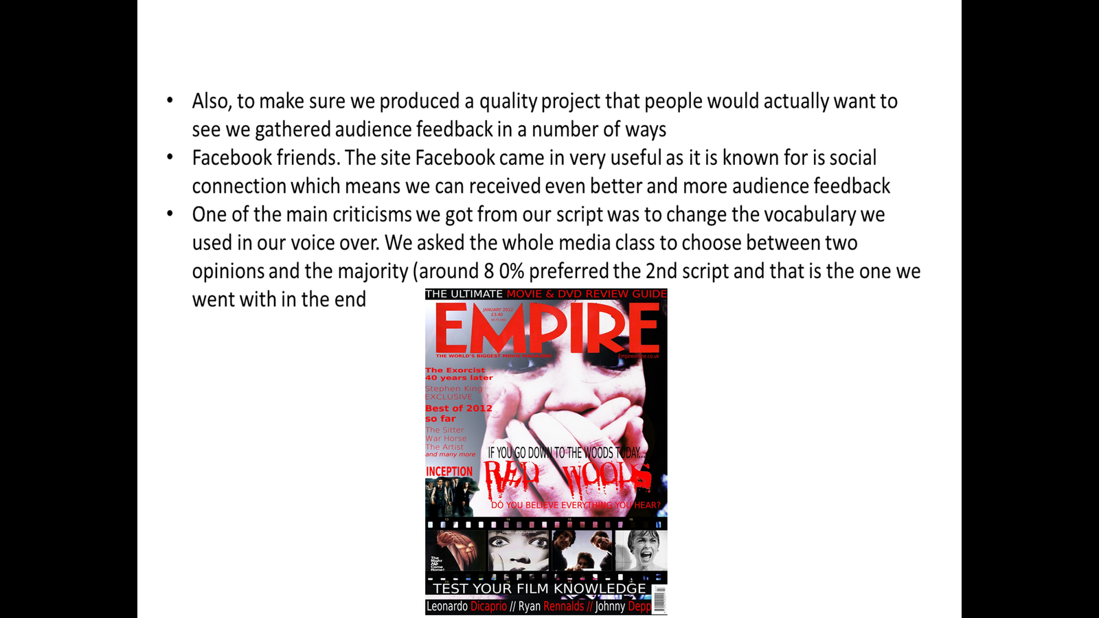
history of distributing films of ever genre. We also commented on the trailer that it was by the same creators of Blair Witch and this was to ensure to the audience, that the two films will clearly have many similarity of the horror genre. Empire was clearly our magazine cover distributor - and that is mainly because it is a huge magazine company purely dedicated to film - and i am also a regular reader so it seemed like the perfect opportunity to advertise our product with them as we felt very comfortable.  
3. Who would be the audience for your media project?
Our general age range was between 15 -21 and we then started to use certain social networking sites and available resources to gather some more information to improve our product. The site facebook came in very useful as it is known for is social connection which means we can received even better and more audience feedback for example, a friend of a friend. I plan to comment on this in our evaluation as I think we have covered our audience research very well by using a range of different methods such as social networking, allowing us to achieve the best product. Me and Imogen then took time out of lesson to find our younger friend in Year 8 to complete the voice over in an empty classroom ( to make sure the audio wasn't muffled).However, in the end , we ended up contacting our lead actress Emma Dixon and asked her do the voice over. As we didn't want the audience to think Emma was Ruby from the myth, we editing it on Adobe Photoshop CS3 and we heightened the pitch of her voice (as she was young when she died in our story). We tried overlaying the audio track over our trailer to see which one fitted in better and Emma's voice over was a dramatic improvement compared to our first version - as it sounded a lot of scary and dark. Another advantage of using Emma is one, that she already had experience with working with me and Imogen in this product so she knew what to expect and also she knew in detail what the story was about (as she acted in it) - so when it came to recording the voice over she knew perfectly to speak slowly and also put on a freaky and mysteries tone of voice.

We also used 6th form to gather some audience feedback. All within our target audience range from around 15 to 21. We also asked a range of males and females to make sure our results were not biased as we want a target audience of both genders. By getting more audience feedback will ensure that our product will be finished at a higher standard because of involvement from the general public (who is the audience for our film). Our poster is close to completion. We are spending a lot of time in making sure that our poster and magazine cover are not to similar. For example, the magazine cover is aimed more at the specific film audience and the image is often covered in many other advertisements for films and other sponsors. Whereas our poster will be simply our main image, the name and some information in small writing at the bottom of the image with information such as director, actors, times of release etc.
4. How did you attract your audience?
 To attract the audience, we first had to figure out what they wanted to view so we used this to our advantage by asking people in the age range of our target audience. One of the main criticisms we got from our script was to change the vocabulary we used in our voice over. We asked the whole media class to choose between two opinions and the majority (around 8 out of 10) preferred the 2nd script and that is the one we went with.

     Unlike our as project were we only used a female actor, we decided to make sure we had at least 2 actors of different genders. We hoped that this would help to attract a wider audience of both genders as they will all have someone else to relate to .Also,  the voice-over provided for the trailer greatly emphasises what the audience will see within the film - In our original plan - we thought that we would find our friends sister to do the voice over as she is only 12 and has quite a high pitch voice, however, when she actually read out the script, it sounded very minicy and in the end we used Emma - and the voiceover was perfect -  and alot more easy to obtain as we already had Emma involved in our project. Our trailer has different clips to attract people to see the main feature (our film), for example, as ours is a horror – our trailer shows clips of people screaming, hiding, running. We were also sure to set our trailer in a realistic environment that our audience will be able to relate to hence being in a forest camping so our young audience should be able to relate the activity shown in our trailer and connect better with the material. And as you can see from our poster below, it is very similar of many other cult horror films such as Halloween and The Shining - both with an interesting image and huge bright font to attract hopefully an audience which is expecting. We took alot of inspiration from Empire and Total film as they are 2 of the largest film magazines in the UK – advertising films from all genres.

    5. What have you learnt about technologies from the process at constructing this product?
When i first discovered the location, I knew it would be perfect for our film, after we had to revisit to get some extra footage, it became a real problem, travelling miles in a school day and we also had to make sure we arrived at the right time so the lighting was correct - (as we wanted to film around 4, when it began to get dark, but still light enough for the camera to pick up the image). Also, considering 2 out of the 4 of us (Emma, Liam, Me and Imogen) have part time jobs on weekday and weekends, we had to choose a date that was appropriate for all of our team members. However, the setting I found was perfect for all of the things we required from our movie setting, such as very large trees to create the atmosphere of darkness and unwariness and it was also a very remote area which I noticed when I was first visiting the area while walking my dog. While we were filming, we did not run into a single member of the public - this keeps our setting true to the story of being a remote place where nobody visits, coming across as more dangerous. 


We had a few issues with editing, credits and just the general technologic equipment we were given from the school. One of the main concerns we had with editing was the light. We thought we would play it safe by filming at the end of day when it began to get dark, rather than filming at night. An advantage of this is that, even though the image we got is very light, we could dull/darken it down with our editing software. Even though this takes a bit more effort, we wanted to make sure we didn't lose any footage because of poor lighting. In the end, even though our film is still very (and this doesn't convey the typical horror style), we are certain, in our time frame, we will make our image alot darker, as it is very unlikely that horror films are based in the daytime. For example, Amityville Horror (2005), only around 15% of the film was shot in daylight and the rest was at night time - this being because of the uncertainty. However, we are at a disadvantage considering we do not have the best technological equipment. Our camera had quite poor sound recording quality and we had to make sure it wasn't too dark; otherwise we could pick up the image. Staying with editing, we finally have our editing of the title finished (with help from Darren Elliot); it contains both transitions of the text and a 3D quality. 3D texts use 3D primitives to draw the audience’s attention to the lines of the text on the screen - therefore making it more eyes catching and standing out to other competitors. In the end Darren Elliot, used Imogen's updated version of photoshop to ensure that the film could handle the credits ontop as it created many problems and set back our presentation time around 2 weeks.


Also, our print products are now of a very high standard (pictured above), you can see we have remembered to stick to our original colour scheme - that consists of red, black and white). After I completed detailed research in Empire front covers, with Imogene’s art skills, we were able to produce a very original looking movie poster.

After I research Empire’s - ((July 2008) The Dark Knight (2008)), even though it is not in the specific horror genre, the print product itself comes across as very threatening. They do this by the use of scratching lettering on the cover - it is meant to suggest to the audience that it was done by using a knife (suggesting that he is a very dangerous character that frequently carries weapons). To convey our research, we knew our main priority was to convey the feeling of terror and our main character becoming scared. Emma ( Our female actor), has her hands across her face to suggest that he is being chased and can’t even let the "killer" know where she is and they could hear her breathing. While was took, this photo, we were planning to use a long shot to show the environment, but we found that a close up was much more effective for representation fear in our characters eyes. We also research further in both Empire and Total film into the text that is shown on the front of horror film advertisements on their magazines. Imogen past experience from photo-shop in art came in very useful which means our print products came out at a very high quality and clearly represented our genre clearly.
We spent alot of time researching products for our trailer such as eden lake which we didn’t actually discover until we started our print products and have already started our trailer. And this created an issue - as we didn’t take any pictures when filming as we were planning to use some still shots from the videos we had already.however, these were of very poor quality, so we actually found a different setting to achieve these – which was much more assessable. technology actually came in very useful when it came to editing in a silhouettes of the villain, which Emma was hiding from. The silhouette was actually imogen wearing my coat therefore symbolising evil and darkness as she is shown in bad light, whereas, Emma represents the "good in the film". 
The magazine cover i believed caused alot of problems however, when we finally completed the project, it became the best part of our package. we decided to use Empire as i am a monthly reader. We had to visit our 2nd setting to get a photo of Emma looking terrified with her hand over her mouth indicating she is speechless – which also links in with our location – as no one could hear her regardless. On the photo, we added a small darkness tint, and this also helped our title and text to be even more eye-catching. Similar to Empire, we also advertised other horror films at the bottom, to clearly show that it was a certain magazine edition that was purely dedicated to horror films. 

6. Looking back at your preliminary task, what do you feel you have learnt in the progression from it the full project?

From both our task and our AS project, we have learnt how to plan and research in a lot more detail. And Imogen also used her past experience that she learnt from art in developing our print products in class.
We spent too much time trying to develop a story line and not enough time in finding quality actors. Our original plan was to of used 3 actors - 1 female and 2 male. However, even the use of these 2 actors became a struggle as they were never available at the same time and if they were, the transport then became an issue. however, if finding a 3 actor wasn’t hard enough - we then had the issue that we could fit a driver, 2 crew members and 2 actors into 1 car - along with all of the camping and film equipment - so in the end - 3 actors turned out to be more adequate. If we were to repeat the experience, I think - even though it would of been more of a struggle, that we should of used 3 actors as it is very unlikely and realistic to find a film with only two actors and no influence from any other outside influences -  as they were set in such as remote environment. The biggest progression I think we've had in our knowledge in technology. Imogen's art skills really helped us to progress with our print products, however, Imogen missed a few lessons and this became an issue as the work was on her laptop on a updated version that was not on the school computers. 

What changed throughout our product.

The overall basis of our timeline differs alot from mine and Imogen's original design of what we expected our trailer to look like. However, it can be seen in my evaluation why we made so many changes. The of the biggest changes is that we original decided to have 3 actors instead of two - because with just two, the actors looked more like a couple rather than friends out camping  however, in the end, it turned out more beneficial as it was hard enough having 2 crew members and 2 actors all available on the same day anyway. 

Friday 30 March 2012


4. How did you attract your audience

·         By using actors of the age – and of both genders – unlike AS – only a female actor. We hoped that this would help to attract a wider audience of both genders as they will all have someone else to relate to .

·         The voice-over provided for the trailer greatly emphasises what the audience will see within the film - In our orignal plan - we thought that we would find our friends sister to do the voice over as she is only 12 and has quite a high pitch voice, however, when she actually read out the script, it sounded very minicy and in the end we used emma - and the voiceover was perfect -  and alot more easy to obtain as we already had Emma involed in our project.

·         Our trailer has different clips to attract people to see the main feature ( our film ), for example, as ours is a horror – our trailer shows clips of people screaming, hiding, running

·     Most teenagers have been on camping holidays - so our young audience should be able to relate the activity shown in our trailer
And as you can see from our poster below, it is very similar of many other cult horror films such as Halloween and The Shining - both with an interesting image and  huge bright font to attract hopefully an audience which is expecting


6. Looking back at your preliminary task, what do you feel you have learnt in the progression from it the full project?

From both our task and our AS project, we have learnt how to plan and research in a lot more detail. And Imogen also used her past experience that she learnt from art in devleoping our print products in class.

What would you change?

We spent too much time trying to develop a story line and not enough time in finding quality actors. Our orignal plan was to of used 3 actors - 1 female and 2 male. However, even the use of these 2 actors became a struggle as they were never available at the same time and if they were, the transport then became an issue. however, if finding a 3 actor wasnt hard enough - we then had the issue that we could fit a driver, 2 crew members and 2 actors into 1 car - along with all of the camping and film equitment - so in the end - 3 actors turned out to be more adequate.

Thursday 29 March 2012

Presentation and Evaluation

We finally completed our group presentation to the class on Tuesday which lasted around 20 minutes including our trailer and the explanation of why we did what we did, research and the background to our project. Now I will be fully focused on our evaluation as the deadline is this Friday - However, we still have a few last editeds and touch up to our trailer, as we are still having few issues with the audio. In the evaluation I have ensured to make sure that i commented on what i have learnt from completing our A2 piece and what i would of done differently if i had the chance to redo our piece of work. As Imogen is off today, this means that we do not have her laptop so we cannot edit the work in class - so therefore - hopefully she will be in tomorrow so we can apply our finishing edits. I am currently uploading our presentation to the blog.

Friday 23 March 2012

I have currently uploaded the 11 slides from our presentation however, we have still not presented this because of delays with our trailer - as are still trying to edit the credits. we also had a small issue with the audio however, that has now be fixed but the credits are still a work in progress. We plan to have this finished by Tuesday as i am focusing more on our evaluation - and with the deadline of Friday quickly approaching - they will be posted on the blog by Friday. In our evaluation, i have included all 7 main questions and also with a few extra questions to back up my points and views about the project its self such as
  • Why we choose our certain location?
  • Why we decided to use actors of different genders?
  • Why we decided to use Emma on our print products rather than Liam?
  • And more that i will post shortly ( By Friday )

Thursday 22 March 2012


We have currently made many improvements to our work and i have know finally completed out presentation powerpoint. It includes 11 slides and alot of audience feedback and research. we were meant to be presentting our powerpoint and products today however, we are still having issues with the credits so we have had to prolong it to Tuesday lesson. Here is a look at our powerpoint which runs through all of our 3 products.

Wednesday 14 March 2012

Touch Up's and edits

We have had to return back to the editing of our movie trailer, because of some poor editing and bad sound dialogue. Imogen will now be bringing in her laptop again to lessons so we can edit the material again together and i am currently working on the evaluation at home - (based around the 7 main questions). As we have already completed our interview, we still have to complete our group presentation (which is on Friday) and to finish our evaluation. I currently have the basis for my 7 main points however, i plan to spend a good few more hours filling it out to ensure that i cover all of the information needed and to make sure it is in enough detail.

Friday 9 March 2012

Our Interview

Our Interview (Completed) and our Presentation (next week)

Me and Immy have just completed our interview on our 3 pieces of work - or trailer, poster and magazine cover. I also have my written evaluation questions which i will be uploading shortly.As all of our 3 projects are now completed, we will be focusing on creating a "making of video" and also "an audience reaction video" to help us back up our evaluation.For the making of video, we will only need our 2 actors and 2 crew members, however, for the audience reaction video, i plan to include at least 10 different people to voice there opinion on our work. I am bringing in my camera tomorrow as i have already found 2 people who are willing to be recorded and give their opinion on our film.
At this very moment, i am also creating our PowerPoint which we plan to show to our media class next week as part of our evaluation. This will include :
  • The run through of our trailer (around 2 minutes)
  • Both of our print products - poster and our magazine cover
  • Audience research
  • Similarities to other horror films and there codes and conventions
  • Why we chose our certain location
  • And lastly, our inspiration and first rough edits of our magazine covers and posters before we got to our final product.

Monday 5 March 2012

The making of our Poster


As you can see from the two pictures above, our poster has differed over time. When we first started designing posters we planned on having the slogan "if you go down to the woods today" on the tree, however, when we finally added the text on, it didn't look very professional and looked very amateurish. So once, we added on the credits at the bottom of the poster, i though it looked better to have the slogan on top of the text instead of in the middle of the poster. We then added a white to red tin on the text so it looks like as the storyline goes along it gets darker. For obvious reasons we chose to have our release date on the "April 13th" which is of course, A friday - representing the horror genre worldwide. As you can see apart from the text, the poster is quite dark, so we though it would be more affective to have "Ruby" almost connected to the text, otherwise some people may not be able to see her as the silotte is black and so is the foreground. Even though the picture of Emma that we took was effect, it needed some editing (mostly a dark tint on photoshop) to make sure we were really targeting our poster at the right audience, otherwise it could look like a thriller instead of a horror.

Friday 2 March 2012

Deadline for products

As our deadline is today, Me and Imogen are planning to use the hour this afternoon in class and another hour at mine afterwards to make sure our work is to a high enough standard. We have now completely finished our magazine cover - which we have recently posted on our blog - and just have some final tweaks to make to our trailer and our poster (very nearly finished). We were improving our poster yesterday by studying our other posters such as the film Eden Lake, Halloween and Blair Witch, to look at how they had set out the credits at the bottom of the poster - all of the poster included information such as main actors, date of release, production company, distributor and a slogan.
This picture above, is that one that we were interested in as we liked where the slogan was placed and how the credits were all tightly compacted together. In our poster, we have created something were similar as our slogan is very visible and near the main picture of our actress hiding from the killer behind a tree.
By the end of today, all of our 3 products will be uploaded to our blog.At this moment, we are adding 20th Century fox, and Regency logo's at the bottom of our poster to show the audiences our distributors and also it helps us to make our poster look more official.  Our poster is now completed and shortly, we will be uploading our finished product to blog. Our final alterations were things such as
  • the rearranging of text
  • resizing of text
Both of our products are representing the same product, however, they have very different styles. Our poster comes across as alot more scary as we have used alot more editing to make the image and the whole poster darker. However, we believe that our two products clearly represent the horror genre.As we now have the two print products uploaded, our trailer will be uploaded via Immy's blog today.

Thursday 1 March 2012

Magazine cover and Editing - Analysis of audience feedback

As you can see on our magazine cover, we altered the red colour of our text to ensure that is wasn't to little or too dark because we knew the wrong colour text could make our cover come across as too cheesy and it could give of the wrong impression. Shortly, we will be adding text to our to poster and we plan to use the same colour red however not in the same sense as advertising the name of the magazine. We are thinking of using this colour font to show the details at the bottom of the poster ( such as the times and actors), as red really stands out on this certain photo. Even though our poster is not near completion, i will next in the next blog, upload our work in progress and also show the certain tools and methods we used to alter it to our ideal product - as we believed we achieved a good quality of work with our magazine cover ( which is now completed).
Analysis of audience feedback
Me and Imogen have recently collected feedback from some more people and we have found that most of them think our poster is very effective however, around 2 percent of people think we should may the tint on our work a little bit darker so it looks more like a horror film. We plan to do this as well as continue work on our poster in lesson.

Thursday 23 February 2012

Our trailer and our print products

As our deadline is quickly approaching, we have been focuses more on our trailer in school time and our blogging in our own time. Meanwhile, i have been editing the evaluation to get it to the highest possible standard. I have also looked back when we actually did our filming and i have tried to identified some problems areas that we came across. however, from our last filming experience, me and Imogen have learnt that the cameras have a problem filming in dark conditions as they cannot pick up the image very well. To counterbalance this, before we filmed we decided to film at an earlier time and then later tint our video. this gave us an advantage as it meant we wouldn't have to worry about a poor image.We hope that our trailer is to a high standard considering we have got audience feedback from a number of resources
> our media class
> Facebook friends. The site facebook came in very useful as it is known for is social connection which means we can received even better and more audience feedback for example, a friend of a friend. I plan to comment on this in our evaluation as i think we have covered our audience research very well by using a range of different methods such as social networking, allowing us to achieve the best product. One of the main criticisms we got from our script was to change the vocabulary we used in our voice over. We asked the whole media class to choose between two opinions and the majority (around 8 out of 10) preferred the 2nd script and that is the one we went with. Me and Imogen then took time out of lesson to find our younger friend in Year 8 to complete the voice over in an empty classroom ( to make sure the audio wasn't muffled).However, in the end , we ended up contacting our lead actress Emma Dixon and asked her do the voice over. As we didn't want the audience to think Emma was Ruby from the myth, we editing it on Adobe Photoshop CS3 and we heightened the pitch of her voice ( as she was young when she died in our story). We tried overlaying the audio track over our trailer to see which one fitted in better and Emma's voice over was a dramatic improvement compared to our first version - as it sounded a lot of scary and dark. Another advantage of using Emma is one, that she already had experience with working with me and Imogen in this product so she knew what to expect and also she knew in detail what the story was about ( as she acted in it) - so when it came to recording the voice over she knew perfectly to speak slowly and also put on a freaky and mysteries tone of voice.
> Members of sixth form - all within our target audience range from around 15 to 21. We also asked a range of males and females to make sure our results were not biased as we want a target audience of both genders. By getting more audience feedback will ensure that our product will be finished at a higher standard because of involvement from the general public (who is the audience for our film ). Our poster is close to completion. We are spending a lot of time in making sure that our poster and magazine cover are not to similar. For example, the magazine cover is aimed more at the specific film audience and the image is often covered in many other advertisements for films and other sponsors. Whereas our poster will be simply our main image, the name and some information in small writing at the bottom of the image with information such as director, actors, times of release etc.

Sunday 19 February 2012

Our final print product and Evaluation

Now that our trailer has been uploaded (Via Imogen's blog) and our Empire cover is finished. We have now started the poster and also adding final tweeks to our trailer in school lessons. Meanwhile, out of school, i have started writing up notes and key points for our evaluation.As we will be presenting out work to the class and also conducting an interview, I have went into alot of detail to make sure i cover all of the points and possible questions we could get asked. For example, I have grouped them into categories of research, planning, shooting and editing.In my next blog i will be uploading my findings as i have also recently uploaded our video to Facebook so before we submit our final piece, we can make improvements to our work that our audience have suggested. 

Monday 13 February 2012

Poster Print Product


As we have finished our magazine cover, we are now well on our way to completing our poster. However, we have included a lot more editing techniques such as replicating the image of Ruby to stand behind our lead actress Emma. The picture we original took of Emma did not have Imogen in the background. But thankfully, as we took so many extra shots of the setting and of Emma, we could merge to images together so we could produce the best possible image. After we copy the image of Imogen across to our photo, we decided that is looked so good that we would replicate it so it looks like there was no escape for our lead actress. To alter the image, we used photoshop pro to select Imogen was the image and delete the surrounding background so we could have layer it over the top of our original photo (which was Emma infront of the tree).

Thursday 9 February 2012

Deadline Final Magazine Cover

We have finally produced  our final Empire film Cover. Very similar to the Empire Cover advertising "The Shining" .Pictures below. After a few alterations such as removing a full stop, and increasing the size of some of the font, we finally have a finished product. We came up with the name red woods by complete cowisidence.

Both the photo of an extreme close up, the text and even advertising methods are the same. For example, both covers have at the both of the poster show a film strip of past well known horror films.Both also show a small snap shot of Halloween. Hopefully the main distinction between these two posters is that our poster is aimed at a younger audience than The Shining ( as the audience for The Shining should be 18 because of its classification. Both of these posters use an extreme close up, however, our poster is clearly showing the victim of the story, where The Shining shows Jack as the psychopath. Because of the strong connection between these two posters we hope that just from a glimpse our audience will be able to recognise is as a horror advertisement.
The two posters have similar colour schemes of red, black and white. Red - being the typical colour for horror films, representing blood and gore and black representing darkness. The white comes in very useful in our colour scheme as it is very visible against the dark backgrounds ( and that is why we used if, after researching magazine covers). The last thing we would want, is for our poster to have confusing and unclear text as people would just ignore it and not bother wasting time. We think our poster fits in very well in the horror genre because of it connotations to the audience by showing a very disturbing and frightening picture of our main actress Emma and it general overall structure and colour scheme.The close up is very effective however, it was not our original idea as we were planning to have a extreme long shot to help us show the scary environment in where our horror film was based.

"The making of" Imogen Moore and Stephanie M

The advantage of our film set is that right behind the tree, was a steep small hill.this gave us an advantage as it meant we could take our photo homever, we didnt capture the public places in the back such as the public footpath and local houses.Also,as Imogen ( or Ruby) is stood at the top of the hill which makes her looks more powerfuland dominering. Also, we were very forture as it was a very clear sky. This means that when we come round to editing, it will be more easy as there won't be any mixed colours in the sky and it would all turn out a very dark more scary colour.

This picture above was our orginal idea of that shot. We were planning for me to take the picture, Emma to be infront of the tree and Imogen behind her as Ruby ( the girl from the myth ). When we went to take the photo, it happened to be the day that our camera broke and the footage was lost. Since then, we have obtained our finally photo which only includes Emma - as we wanted all of the focus to be on Emma rather than Ruby - this is because in the trailer, Ruby is never shown however, we wanted to get Emma well established with our audience.


This picture above is the tree we used in our photo shoot, however, we decided to take the shot of the bottom of tree, As you can see the tree is quite haugthing, however, our actor could not reach that height and the roots of the tree looked a lot more scary and helps us to enclose our actor almost like she is sitting in the tree. When we first found the tree that we wanted in our shot, we had planned to have text on the bark however, when we finally got round to experimenting with font, it looks to crowded and unrealistic.
As you can see from the picture above, it clearly shows a public fence and a public path. As our trailer and magazine photo cover were taken in places, we had to make sure that both of the pictures resembled one another. To compensate this, we took an extreme close up of Emma ( our main actress) against a tree in the woods - this ensured us that we would not get any unwanted objects in our shot such as people passing through, roads or houses.

Friday 3 February 2012

Starting our poster

We have recently started on our poster and we are trying to make it a bit scarier so it actually looks like it belongs in the “horror genre”. To do this, we have edited the photo on Photoshop by adding some a dull red layer over the top of the photo. Not only does this help to make it look scarier but it also blocks out a lot of sunlight as our photo was taken during the daytime. We have also edited some of the back ground of the picture as we wanted fore ground to attract more attention. The fore ground we have tried to draw the attention to the most is Emma ( our lead actress) and the main tree that she is hiding behind. The poster above this, is our image edited so far, considering our magazine cover is completed. In the next few lessons, we plan to edit the photo a bit more by editing the lightness of the photo and hopefully making it darker and therefore making it seem a bit more scary and after we have completed these stages we will then add the text. However, unlike the movie cover, we will include more information about the film's release - such as dates - unlike the movie cover which is mostly advertising, considering it has to advertise other stuff inside of the magazines. The poster will give us more of a chance to persuade the audience to go and see this film ( as it purely just to tempt the audience, into seeing just this one film). 

Wednesday 1 February 2012


The two pictures above show our “Log Sheet” from media. However, it does not contain that much information considering we filming all of our footage on the same say with only two crew members and two actors. However, during filming, as me and Imogen were setting up our tripod, we let Liam and Emma have the camera's to film some of their own footage ( which we plan to include in the making of). Hopefully today ( or in at least the next two days ), we plan to filming our main actress Emma talking about her acting experience. I have recently contacted Emma and Imogen and we planning to shoot some more with Emma - mainly just in more detail about her experience and general questions such as
  • If she believed we did our job correctly?
  • Did she enjoy the experience?
  • Did Liam put in as much effort as her?
  • If she could do it again, what would she change?
  • Do you thinking the setting and storyline was appropriate?
  • Did the crew members give you an opportunity to include your own opinion?
We also plan to let Emma give me and Imogen some questions such as -
  • Did the whole experience go how you predicted it?
  • Did the actors do a respectable job?
  • Now you have started editing, is there any think you would do differently? - such as filming some more material, filming at a different time of day, filming an alternative ending, film at a different time of day?

As one of our print products is near completion and the 2nd one is currently been worked on, I though it would be a good idea to include some more-in-depth knowledge about our filming experience and how we have progressed from AS. Also, the answers we obtain from Emma will come in very useful in our evaluation ( which is not very far off), Me and Imogen have already come up with a basic outline of answers as we know we do not have that much time left - and we still need to complete our final print product) and we want them both to be to the highest standard  we can achieve. 

Tuesday 31 January 2012

This weeks plan -Tuesday lesson

Imogen have brought in her laptop, so we can both have a final run threw of our trailer. We also plan to include a few more titles and credits, (as in my personal view), i think it looks a bit more like a film clip rather than an edgy, fast paced trailer. To counterbalance this on Tuesday, we are both going to observe our piece and choose points we both agree on, on where to add the appropriate credits.
The picture shown above is a "Typical" ending to a trailer,which often includes information for the audience such as
  • The name of the distributor
  • Production
  • Name of the director ( often if they are very well known) and who it was written by
  • Name of the movie
  • Logos
  • And most commonly - other forms of information such as movie websites that promote the films
We already have already planned our together what we are going to include in the final slide of our trailer. Most basically, we are going to include the name of our film. Uncommon to other trailers, we are going to include our title on a page of its own, considering this is our first production. This credit page above ( for Super 8), has clearly been designed to draw attention to the title instead of the artwork.
Imogen's laptop at the moment is broken, however, it will be back tomorrow. Meanwhile we are focusing on our poster ( as our poster product is near completion). For the time being, we already have our chosen image for our poster but we are not certain which texts look good together, considering we don't want our two prints products to look identical as they will be advertised in different places and for different reasons for example the Empire cover is aimed directly at film fans, whereas hopefully, our poster will be advertising to everyone as it could be advertised at a bus stop, billboards, radio and television stations.

Friday 27 January 2012

My Audience Research-( To help with the evaluation )

The picture above is the questionnaire i have recently been handing out around Sixth Form to get some audience feedback on our print products. The graph below shows my results -

This pie chart shows the answers. the question was " What genre do you think the poster represents"

This pie chart represents "What do you think is the best part of the magazine cover?"
This bar chart shows the answer of the participants. it was "Do you think it represents the horror genre well?"
  • The majority of the feedback was positive. One question i included in the questionnaire was
  • "Please state on advantage and disadvantage of the poster?"
  • we received answers such as 
  • it advertises the film very well and looks very scary
  • very clear image, however, there is no tagline
  • you can understand straight away it is a horror film - but some of the font is difficult to read
Some people also wrote a few improvements we could use such as "make the front cover less crowded" and "not to place a lot of text across the image. So the main critism was that our poster had to much font and looked a bit over crowed. To compensate this, we have returned to our print product and we are going to alter some of the text to different parts of the page and at different angles to make they visible however not overcrowding so our print products don't come across as "tacky".

Thursday 26 January 2012

Basic points for our evaluation

Plan for my evaluation
Main problems we came across

  • Unreliably actors
  • Poor setting choice ( because of the distance)
Even though, when I first visited our setting, I knew it would be perfect for our film, after we had to revisit to get some extra footage, it became a real problem, travelling miles in a school day and we also had to make sure we arrived at the right time so the lighting was correct - ( as we wanted to film around 4, when it began to get dark, but still light enough for the camera to pick up the image). Also, considering 2 out of the 4 of us (Emma, Liam, Me and Imogen) have part time jobs on weekday and weekends, we had to choose a date that was appropriate for all of our team members. however, the setting i found was perfect for all of the things we required from our movie setting, such as very large trees - to create the atmosphere of darkness and unwariness and it was also a very remote area which i noticed when i was first visiting the area while walking my dog. While we were filming, we did not run into a single member of the public - this keeps our setting true to the story of being a remote place where nobody visits, coming across as more dangerous. 
Editing
One of the main concerns we had with editing was the light. we though we would play it safe by filming at the end of day when it began to get dark, rather than filming at night. An advantage of this is that, even though the image we got is very light, we could dull/darken it down with our editing software. even though this takes a bit more effort, we wanted to make sure we didn't lose any footage because of poor lighting. in the end, even though our film is still very ( and this doesn't convey the typical horror style), we are certain, in our time frame, we will make our image alot darker, as it is very unlikely that horror films are based in the daytime. For example,Amityville Horror (2005), only around 15% of the film was shot in daylight and the rest was at night time -  this being because of the uncertainty. However, we are at a disadvantage considering we do not have the best technological equipment. Our camera had quite poor sound recording quality and we had to make sure it wasn't to dark, otherwise we could pick up the image. Staying with editing, we finally have our editing of the title finished ( with help from Darren Elliot), it contains both transitions of the text and a 3D quality. 3D texts use 3D primitives to draw the audiences attention to the lines of the text on the screen - therefore making it more eye catching and standing out to other competitors.
Also, our print products are now of a very high standard ( pictured above), you can see we have remembered to stick to our original colour scheme - that consists of red, black and white).
After I completed detailed research in Empire front covers, with Imogen’s art skills, we were able to produce a very original looking movie poster.

after i research empires - ((July 2008 )The Dark Knight (2008)), even though it is not in the specific horror genre, the print product itself comes across as very threatening. they do this by the use of scratching lettering on the cover - it is meant to suggest to the audience that it was done by using a knife(suggesting that he is a very dangerous character, that frequently carries weapons). To convey our research, we knew our main priority was to convey the feeling of terror and our main character becoming scared. Emma ( Our female actor), has her hands across her face to suggest that he is being chased and cant even let the "killer" know where she is and they could here her breathing. While was took, this photo, we were planning to use a long shot to show the environment, but we found that a close up was much more effective for representation fear in our characters eyes. We also research further in both Empire and Total film into the text that is shown on the front of horror film advertisements on there magazines. We decided to use words such as
  • Intruders
  • Horror
  • "Who's watching you?"
  • Also, we included the name "Stephen King" - (known by most of population as an amazing horror writer)
Also, a very conventional representatyion is the colour red represenitng blood. Shown in the film two Empire covers above ( The Shining and The Dark Knight), both extreme/mid close up. In our orgininal plan, we were planning on shooting a long shot, however, after extensive research, we found that if we really want to convey horror, we really need the audience to see the characters emotion close up. As you can see, our magazine cover and The Shining cover, are very similar, both in the shot used and the colour scheme ( the use of red again)